
Scrapbooking has a quiet kind of magic. It takes everyday photographs, little scraps of paper, ticket stubs, handwritten notes, fabric pieces, pressed flowers, and all those small things we keep without fully knowing why, then turns them into something meaningful. A scrapbook page is not just a decorated album page. It is a memory arranged with care.
That is why finding the right scrapbooking layout inspiration can make such a difference. A good layout gives your memories room to breathe. It helps the eye move across the page naturally. It gives your photos a story, not just a place to sit. And honestly, sometimes it simply helps you begin when you are staring at a blank page with too many supplies and no clear idea where to place anything.
The best part is that scrapbooking does not have to be perfect. In fact, the pages that feel the most personal often have a little looseness to them. A slightly tilted photo, a handwritten note, a layered corner that was not planned too carefully — these are the details that make a layout feel alive.
Starting With the Story Behind the Page
Before thinking about paper colors, stickers, borders, or embellishments, it helps to ask one simple question: what is this page really about? Maybe it is a birthday, a road trip, a family dinner, a baby milestone, a wedding moment, or a quiet afternoon that somehow became special. The story will often guide the layout more naturally than the supplies will.
For example, a page about a beach holiday might feel open, sunny, and relaxed. A layout about a school memory may work better with neat sections, labels, and playful details. A romantic scrapbook page might need softer layers, warm colors, and more space for journaling.
When the story comes first, the page becomes easier to build. You are no longer just placing photos. You are shaping a mood.
Choosing a Focal Photo That Anchors the Layout
Most strong scrapbook layouts have one main point of attention. This is usually the best or most emotional photo on the page. It might be the clearest image, the funniest expression, or the photo that captures the whole memory in one glance.
Once you choose that focal photo, the rest of the layout starts to fall into place. You can make it slightly larger than the others, frame it with patterned paper, place it near the center, or give it extra space around the edges. Supporting photos can be smaller and arranged around it.
This approach works especially well when you have several pictures from the same event. Instead of giving every photo equal importance, let one image lead the story. The page will feel more balanced, and the viewer will understand where to look first.
Using White Space for a Clean and Modern Look
One common mistake in scrapbooking is feeling like every inch of the page must be filled. Blank space can feel uncomfortable at first, especially when you have beautiful paper, washi tape, stamps, and cutouts waiting to be used. But white space is powerful. It gives the layout a calm, polished feeling and allows the photos to stand out.
White space does not always mean the color white. It simply means open space without too much visual activity. It could be a plain cardstock background, a soft pastel area, or an uncluttered section of patterned paper.
A clean layout might include one large photo, a short title, a small journaling block, and a few delicate accents. It may look simple, but simple does not mean unfinished. Often, it feels intentional.
Layering Paper for Texture and Depth
Layering is one of the easiest ways to add charm to a scrapbook page. You can place patterned paper behind photos, tuck small tags under the corners, add torn paper strips, or use vellum to soften a busy background. Layers create depth, making the page feel more handmade and interesting.
The trick is to keep the layers connected to the overall mood. For a vintage family page, torn kraft paper, lace textures, and muted florals can work beautifully. For a child’s birthday layout, bright paper scraps and playful shapes may feel more natural. For travel pages, map prints, ticket-style labels, and neutral backgrounds can give the layout a thoughtful sense of place.
Layering does not need to be complicated. Even two pieces of paper behind a photo can make it feel more finished.
Creating Balance With Color
Color can completely change the personality of a scrapbook page. Soft pinks, creams, and golds may feel romantic. Blues and sandy neutrals might suggest travel or coastal memories. Bright reds, yellows, and greens can bring energy to birthdays, celebrations, and childhood pages.
A helpful approach is to pull colors directly from the photos. If a photo has a blue sky, a red dress, or green garden leaves, use those shades in your paper or embellishments. This makes the page feel connected rather than random.
You do not need many colors. In fact, two or three main shades are usually enough. A limited color palette can make the layout look more thoughtful and less crowded. It also helps different elements feel like they belong together.
Grid Layouts for Simple Storytelling
Grid layouts are perfect when you want a neat, organized scrapbook page. They work especially well for multiple photos, monthly memories, school events, recipes, family gatherings, and travel snapshots.
A grid layout divides the page into clean sections. Some squares or rectangles can hold photos, while others can hold journaling, titles, dates, or decorative details. The result is easy to follow and visually satisfying.
This style is also helpful for beginners because it removes some of the guesswork. Instead of wondering where everything should go, you work within a simple structure. But a grid does not have to feel stiff. You can soften it with rounded photo corners, layered stickers, handwritten captions, or small decorative clusters.
Diagonal Designs for Energy and Movement
If you want a page to feel lively, try arranging the main elements diagonally. A diagonal layout moves the eye from one corner of the page to the opposite corner. It creates a sense of motion, which is ideal for pages about travel, parties, outdoor adventures, sports, or playful family moments.
You might place your title in the upper left corner, your main photo near the center, and a cluster of embellishments in the lower right corner. Or you could use diagonal strips of patterned paper as a background and arrange photos along that angle.
Diagonal layouts often feel less formal and more dynamic. They are useful when a traditional centered layout feels a little too calm for the memory you are capturing.
Journaling as Part of the Design
Scrapbooking is not only about photos. Words matter too. A short note can explain a detail that a picture cannot show: what someone said, how the day felt, why the moment mattered, or what you hope to remember years later.
Journaling can be part of the design rather than something added at the end. You can write around the edge of a photo, place text on a tag, create a small journaling card, or use strips of paper for sentence-by-sentence storytelling. Handwriting adds a personal touch, even if it is not perfectly neat.
Some pages need only a date and a sentence. Others deserve a longer reflection. Let the memory decide.
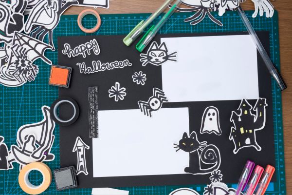
Adding Meaningful Embellishments
Embellishments are fun, but they work best when they support the story. A tiny heart, a ticket stub, a stamped date, a pressed leaf, or a small envelope can add personality without overwhelming the page.
The most memorable embellishments are often connected to the event itself. For a travel layout, you might use boarding passes, maps, hotel cards, or currency slips. For a baby scrapbook, hospital bracelets, tiny handprints, or first haircut keepsakes can be included safely in pockets. For a wedding page, ribbon, dried petals, or handwritten vows can add emotional texture.
Decorations should feel like little clues. They help the page tell its story more deeply.
Mixing Patterns Without Making the Page Busy
Patterned paper is one of the joys of scrapbooking, but mixing patterns can be tricky. Too many bold designs can compete with the photos. A good rule is to combine one strong pattern with one or two quieter ones.
For example, a floral paper can pair nicely with a small stripe or a soft dot pattern. A bold geometric print may work better with plain cardstock or subtle texture. Keeping the color palette consistent also helps different patterns sit together comfortably.
Pattern mixing should feel playful, not stressful. Lay the pieces on the page before gluing anything down. Move them around. Step back for a moment. Your eye will usually tell you when the balance feels right.
Seasonal Layout Ideas That Feel Natural
Seasonal scrapbooking offers endless inspiration. Spring pages can include soft florals, fresh greens, and light backgrounds. Summer layouts might use bright colors, sun shapes, beach textures, or travel-inspired details. Autumn pages often look beautiful with warm oranges, browns, deep reds, and leaf accents. Winter layouts can feel cozy with cool blues, silver touches, layered textures, and handwritten notes.
The goal is not to decorate with every seasonal symbol at once. A few thoughtful details are enough. A warm color palette can suggest autumn without covering the page in leaves. A pale blue background and soft sparkle can suggest winter without feeling too obvious.
Vintage Scrapbooking Layout Inspiration
Vintage layouts have a lovely emotional quality. They work well for old family photos, heritage albums, childhood memories, and meaningful keepsakes. Think aged paper, muted colors, soft edges, handwritten labels, lace details, sepia tones, and layered frames.
A vintage layout does not need to look old-fashioned in a heavy way. It can be subtle. You might use cream cardstock, a small floral pattern, a torn paper edge, and a simple date stamp. The effect is gentle and nostalgic.
This style is especially powerful when the photo already has history. The layout should support that feeling, not distract from it.
Playful Layouts for Everyday Memories
Not every scrapbook page has to capture a major life event. Some of the best pages are about ordinary days: making pancakes, walking the dog, organizing a desk, laughing in the car, or spending a slow Sunday at home.
Everyday layouts can be more relaxed. Try using bright colors, imperfect photo strips, doodles, speech bubbles, handwritten captions, or small repeating shapes. These pages often feel fresh because they are not trying too hard.
Scrapbooking ordinary moments is also a beautiful reminder that life is not made only of big milestones. The small memories deserve space too.
Conclusion
Scrapbooking layout inspiration can come from many places: a favorite photo, a color in the background, a season, a memory, a scrap of paper, or even a feeling you cannot quite explain. The best layouts are not always the most detailed or perfectly arranged. They are the ones that help a memory feel real again.
Whether you prefer clean grids, layered vintage pages, playful designs, or soft minimalist layouts, the heart of scrapbooking stays the same. You are preserving pieces of life in a way that feels personal and creative. A page does not need to impress anyone. It only needs to hold the story with care.